
Location Matters: How the Right Setting Makes Lifestyle Product Photography Work
There’s a big difference between finding a nice-looking room for a product shoot and finding the right room.
When I’m planning lifestyle product photography, the location is part of the creative decision-making long before the camera comes out. Architecture, available light, furniture, color, scale and even the amount of empty space in a room can either support the product or start competing with it.
For this textile shoot, we wanted the photographs to feel residential and lived-in while keeping the products unmistakably at the center of the images. That meant choosing a Connecticut home that could provide several different environments without imposing too much of its own personality on the photographs.
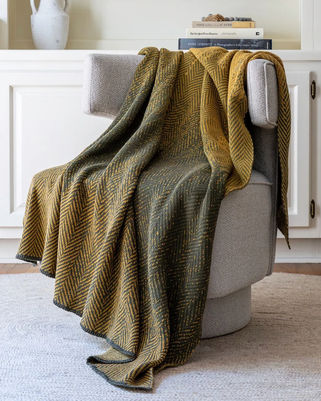
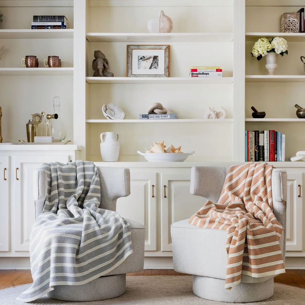
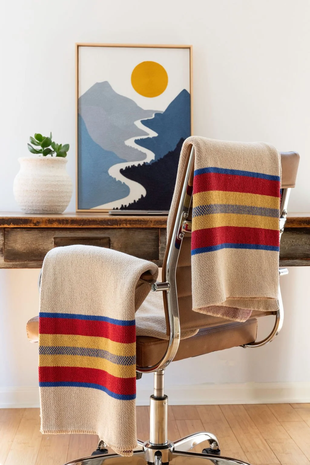
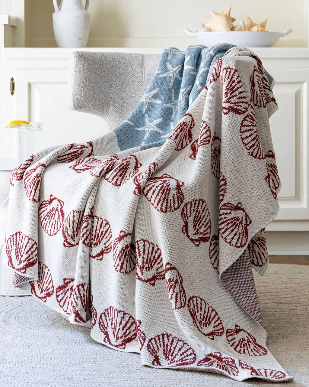
The result gave us something particularly valuable for a commercial shoot: variety without sacrificing consistency.
Start With the Brand, Not the Location
It’s easy to fall in love with an interesting house, studio or Airbnb and then figure out how to make the products work there.
I generally prefer to reverse that process.
Before looking at locations, ask what the photographs are supposed to communicate. Is the product refined or casual? Contemporary or traditional? Premium or accessible? Does it belong in a city apartment, a country house, a coastal home—or somewhere more neutral?
The setting becomes part of that message whether you intend it to or not.
For these throws, a clean residential environment made sense because it showed the textiles in the context where customers might actually use them. But we deliberately avoided creating photographs that became primarily about the interior.
The location gave us context. The products remained the subject.
Look for Variety Within a Consistent Visual World
One of the most useful things a location can give a brand is multiple looks without requiring multiple shoot days.
For this project, simple changes in furniture, orientation and background gave us substantially different compositions while keeping the photography visually connected.
A chair against warm wood and graphic artwork created one environment for the striped throw. A quieter upholstered chair against white cabinetry gave other textiles a softer, more neutral setting.
That variety matters commercially. A brand rarely needs one hero photograph anymore. It needs a library.
The same shoot may have to supply imagery for a website homepage, product pages, email campaigns, social media, digital advertising, press materials and seasonal marketing.
Pro tip: When scouting, don't just look for one great photograph. Stand in the space and try to identify five or six genuinely different compositions. If you can only see one, the location may be less versatile than it first appears.
Pay Attention to the Existing Color Palette
Color relationships can make or break product photography.
A location doesn't necessarily have to match the product, but its colors should have a reason for being there.
With textiles in particular, surrounding colors can change how we perceive the product. A mustard, charcoal and green textile behaves very differently against a busy colored wall than it does against warm whites and neutral upholstery.
For this shoot, the restrained background palette allowed stronger colors and patterns to come forward.
That doesn't mean everything should be beige. Contrast can be useful. The question is whether that contrast is helping you look at the product.
Pro tip: Bring product samples when scouting whenever possible. Don't rely solely on photographs of the location. Paint colors, wood tones and fabrics can interact very differently in person—and the camera may interpret them differently again.
Natural Light Is an Asset—But Only If You Understand It
A room described as having "great natural light" tells a photographer surprisingly little.
Which direction do the windows face? What happens at 9 a.m.? At noon? Is the light direct or indirect? Are there trees or neighboring buildings outside? Does direct sunlight travel across the shooting area during the day?
For lifestyle product photography, I'm often looking for windows large enough to create directional, controllable light rather than simply the brightest possible room.
Soft side light can reveal the weave of a textile beautifully. Harder directional light can make color and texture more graphic. Flat frontal light may be useful for some applications but can make dimensional materials feel lifeless.
The close-up photographs from this shoot are a good example. At that distance, the product isn't relying on furniture or styling to create interest. Light has to reveal the weave, weight and construction of the material itself.
Pro tip: If possible, scout at approximately the same time of day you intend to photograph. A beautiful room at 4 p.m. may be a completely different shooting environment at 10 a.m.
Give the Product Somewhere to Live
Lifestyle photography works partly because it answers a question that straightforward product photography can't:
What does this product feel like in my life?
For home goods, that often means giving the object enough context to make its use immediately understandable.
A throw draped over a chair communicates scale, softness and function. Two coordinating textiles photographed together begin to communicate a collection. A close detail reveals construction and texture.
None of those images replaces a clean e-commerce product photograph. They do a different job.
A strong commercial image library often benefits from both: straightforward photographs that clearly explain the product and lifestyle photographs that give the customer a reason to want it.
Watch the Background More Than You Think You Need To
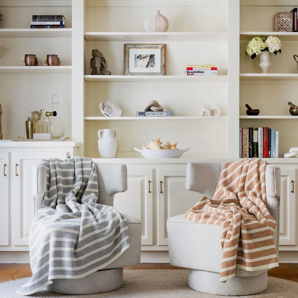
One of the less glamorous parts of professional product photography is spending a surprising amount of time looking at things that aren't the product.
A picture frame coming out of the top of a chair. A shelf intersecting awkwardly with the product. A bright object pulling your eye into a corner. A vertical line that's almost—but not quite—aligned with another vertical.
These small things have an outsized effect on whether a commercial photograph feels intentional.
Locations with attractive built-ins, furniture and accessories can be particularly deceptive. They look wonderful when you're standing in the room, but through a camera they can quickly become visual clutter.
Pro tip: Once you've composed the shot, deliberately stop looking at the product. Scan all four edges of the frame and then examine the background. You'll often find the thing that needs fixing.
Leave Room for the Designer
This is one of the most important considerations when photographing for commercial use.
A photograph doesn't always need to be composed as a finished standalone image.
Brands and agencies may need space for headlines, logos, buttons or other graphic elements. A website banner has different requirements from an Instagram post. An email header may need copy on the left. A print advertisement may need an entirely different crop.
The large areas of negative space available in a good location can therefore be genuinely valuable.
Pro tip: After you get the composition you love, shoot alternatives with usable negative space on both sides when the location allows it. Your client's graphic designer may end up liking you quite a bit.
Think in Terms of a Shot Library, Not Individual Photographs
This may be the biggest difference between approaching a shoot editorially and approaching it commercially.
The objective isn't simply to make a collection of attractive photographs. It's to give the business useful visual assets.
For a lifestyle product photography shoot, I typically think in terms of several categories:
Hero images that establish the product and brand world
Medium lifestyle images showing the product in use
Detail photographs showing texture, construction and materials
Collection images showing products working together
Vertical and square compositions for social and mobile applications
Images with negative space for copy and graphic design
A good location makes it possible to create all of these without the finished gallery looking like it came from five unrelated shoots.
That was particularly useful with this textile project. Moving between wider environmental photographs and very tight texture studies gave the client different kinds of marketing assets while maintaining the same visual language.
A Good Location Should Make the Product Shoot Easier
The best location isn't necessarily the most impressive one.
It's the one that solves problems.
It gives you appropriate light. It provides backgrounds that support the brand. It offers enough physical room to change camera positions. It has furniture or surfaces that make sense for the products. And ideally, it provides enough variety to make a full day of photography look like considerably more than a full day of photography.
That's why location scouting is part of the photography rather than simply logistics.
The decisions made before shoot day often determine how much useful material we can create once we're there.
Lifestyle Product Photography in Fairfield County and Litchfield County, Connecticut
Connecticut gives us a particularly good range of environments for lifestyle product photography—from contemporary homes and traditional New England architecture to rural properties, studios and more editorial residential settings throughout Fairfield County and Litchfield County.
For businesses, home-goods companies, designers and consumer brands, choosing the right environment can turn a straightforward product shoot into a much broader library of brand imagery.
My approach to commercial and lifestyle product photography starts with what the photographs actually need to accomplish. From there, we can determine the location, lighting, styling and shot list that make sense for the product—and make sure we're creating images with enough variety to keep working long after the shoot is finished.